
Orimant Paris
Where Light Meets Legacy
Orimant is a fictional high jewelry house inspired by the spirit of Paris — elegant, radiant, and steeped in timeless charm.
This branding concept was born from the desire to reflect personalized excellence through every detail, from logo to customer touchpoints.


Objective
To design a visual identity that whispers luxury while standing tall with confidence.
The goal: to build a brand presence that feels tailor-made, rooted in heritage, and ready for global resonance.
Creative Direction
The creative approach was delicate yet assertive — inspired by Parisian elegance, classical proportions, and warm, golden light.
The triangle icon reflects aspiration, craftsmanship, and upward motion — a metaphor for the journey of love and refinement.Creative Direction

Design Elements
Typography: A serif logotype with gentle curves to evoke sophistication and human touch
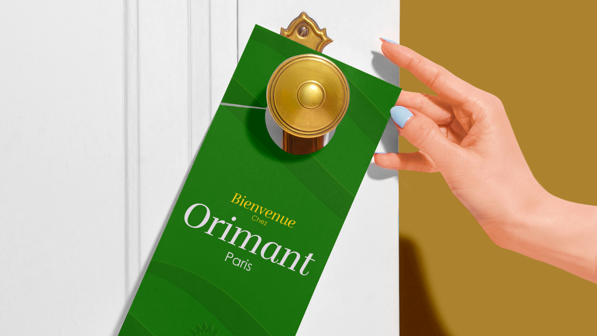
Color Palette: Emerald green for timeless elegance, gold for prestige, and white for purity
Symbol: A gold-pointed monogram shaped like a gem facet or a rising flame — the crown of the Orimant story
Materials: Velvet-textured packaging, embossed paper, and digital details to capture both tactile and visual luxury
Visual Strategy
From bespoke rings to boutique signage, Orimant had to feel like an heirloom — precious, personal, and powerful.
Each visual touchpoint was designed to awaken emotion: the quiet excitement of a proposal, the elegance of a gift unboxing, the intimacy of Parisian craftsmanship.


Tools Used
Adobe Illustrator (logo + pattern development)
Adobe Photoshop (product + packaging mockups)
Blender (3D presentation of retail and product space)
Figma (web layout and mobile-first approach)


Orimant is not just a name — it’s a promise sealed in gold.
A tribute to love, legacy, and the Parisian art of living well.
In every curve, color, and crafted surface, this identity invites the world to pause — and feel something rare.